This is the fastest and most commonly used method that I know of, and one that works for every website.
Most modern browsers (Chrome, Edge, Firefox) have built-in tools that let you preview your website on different screen sizes.
How to do it:
- Open your website in Google Chrome
- Right-click anywhere on the page and click Inspect
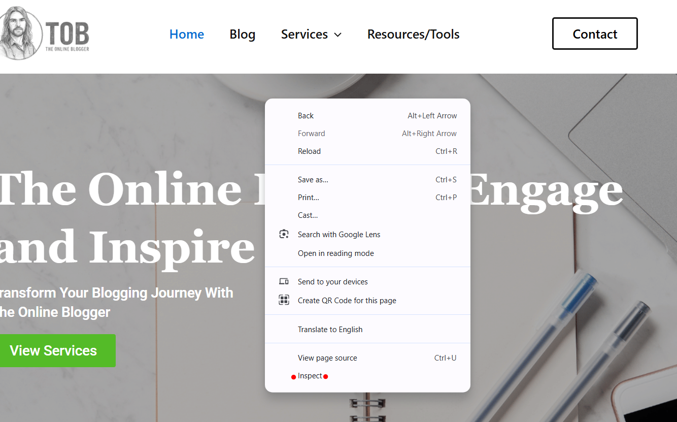
- Click the Device Toolbar icon (phone/tablet icon)
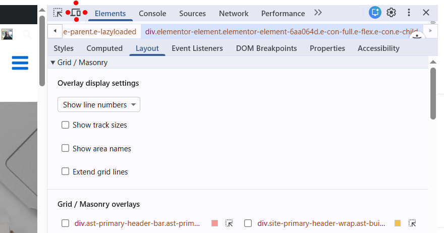
- Choose a device (iPhone, iPad, Galaxy, etc.) or resize the screen manually.

What to check:
- Text size (is it readable?)
- Navigation menu (does it collapse correctly?)
- Buttons (are they easy to tap?)
- Images (do they resize properly?)
 Tip: Drag the screen width slowly to see where layouts break.
This is a simple but surprisingly effective method. Even without tools, resizing your browser helps you spot obvious layout issues.
How to Manually Resize Your Browser Window
- Open your website in a browser
- Click and drag the edge of the window
- Slowly shrink it from full desktop width down to mobile size
What to watch out for:
- Content jumping or overlapping
- Side scrolling appearing
- Elements are becoming too small or misaligned
NOTE: This method won’t show exact device dimensions, but it’s great for quick visual checks.
Online tools simulate real devices and screen resolutions, which makes these tools perfect to check your website works in responsive mode.
Most Popular Tools:
- Responsive Design Checker – Go to the Responsive Design Checker website <<<
- BrowserStack (advanced testing) Go to BrowserStack website <<<
How to use these responsive website checkers:
- Enter your website URL
- Choose a device or screen size
- Review how your site looks and behaves
Thats it!. Easy, fast, and accurate.
Why this helps:
- Tests real-world screen sizes.
- Identifies mobile usability issues.
- Confirms Google mobile compatibility.
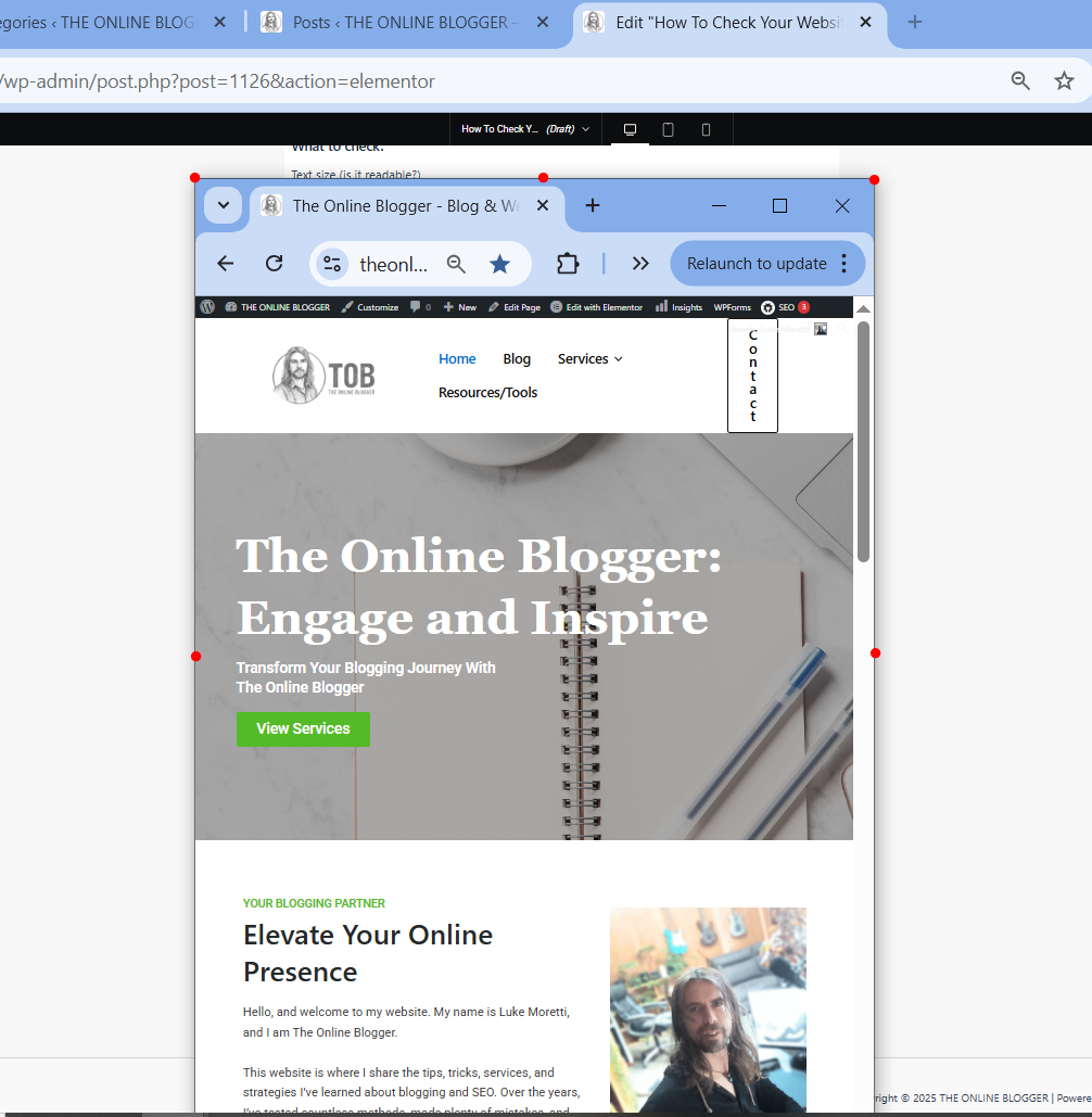
Bonus Tip: If you use WordPress and Elementor for your webpage design, you can select the mobile responsive mode in your edit page and edit the responsive design at the same time as you edit pages or posts.


Wow, I had no idea you could check your website’s responsive mode on Google Chrome and use the inspect option. I am going to try this now and see how it goes. I also didn’t know that there were websites you can go to that can check these things for you, so thanks for that.
Responsive design checker worked wonders for me now on one of my websites. I am going to try the rest now. Is the best way to go about fixing faults changing the theme, or are there better ways?
Some website themes are more designed for responsiveness, so changing the website theme would be a possible option if you are at the start of your online journey. If you have an established website I would recommend editing the way your responsive design looks inside your website editor.
I use WordPress websites (Astra Theme) with Elementor drag and drop editor. This gives me full access to responsive mode and editing…
Thanks so much for your question, and I am glad you found it useful 🙂
Thank you for writing about how to check your website works in responsive mode! This post is a necessary reminder that for writers, our job doesn’t end when the last word is typed; it ends when the reader successfully consumes that final word.
As writers, we spend hours perfecting the rhythm, flow, and structure of our prose. We agonize over punctuation and sentence length to ensure maximum impact. All that effort can be instantly undermined if the reader encounters a broken layout, microscopic text, or frustrating navigation on their phone.
This is a must-do for all website owners… and no worries at all, glad to help 🙂
Thanks for your reply ????