When you choose a web color palette, you influence how visitors feel, how long they stay, and whether they trust your brand enough to take action.
In this guide, you’ll learn:
- Why choosing a web color palette matters
- What different colors make people feel
- The best web color palettes to use
- The best web color palette generators to simplify the process
Why Choose A Web Color Palette
A web color palette is a set of colors used consistently across your website…backgrounds, text, buttons, links, and highlights.
Without a defined palette, websites often look messy, unprofessional, or confusing.
Benefits Of Choosing A Web Color Palette
- Create a strong first impression
- Build brand recognition and consistency
- Improve readability and usability
- Guide visitors toward important actions
- Make your site feel intentional and trustworthy
Pro Tip: A good color palette removes friction. Visitors shouldn’t think about your colors; they should simply feel comfortable using your site.
How To Choose A Web Color Palette (Step-By-Step)
1. Start With Your Brand Personality
Ask yourself:
- Is your brand professional or casual?
- Calm or energetic?
- Minimal or bold?
Your colors should match the emotion you want your brand to project.
2. Choose A Primary Color
Your primary color:
- Appears most often
- Represents your brand identity
- Sets the overall tone of your website
3. Add Supporting Colors
Supporting colors help balance your design and highlight sections without overpowering the primary color.
4. Pick An Accent Color
Accent colors are used sparingly for:
- Call-to-action buttons
- Important links
- Highlights and badges
This is where contrast matters most.
5. Test Contrast & Readability
Always ensure:
- Text is easy to read
- Buttons stand out clearly
- Backgrounds don’t strain the eyes
Web Color Palette Psychology: What Website Colors Make People Feel
Colors trigger emotional responses…often subconsciously. Choosing the wrong colors can push users away, even if your content is great.
Below, I have explained what certain colors make people feel
 Blue – Trust & Calm
- Feels safe, professional, and reliable
- Common in finance, tech, and service websites
- Can feel cold if overused without warmth
 Red – Energy & Urgency
- Grabs attention fast
- Signals urgency, excitement, or danger
- Can increase anxiety or cause visitors to leave if used too heavily
 Green – Growth & Balance
- Associated with nature, health, and money
- Feels calming and reassuring
- Great for eco, wellness, and finance niches
 Yellow – Optimism & Attention
- Feels cheerful and energetic
- Works well for highlights
- Overuse can cause eye fatigue
 Purple – Creativity & Luxury
- Associated with imagination and premium brands
- Works well for creative or high-end services
 Black – Authority & Sophistication
- Feels strong, modern, and bold
- Best paired with lighter colors for balance
 White – Simplicity & Clarity
- Creates space and cleanliness
- Improves readability and focus
- Essential for modern layouts
Pro Tip: Most high-converting websites use neutral bases (white, grey, black) with one strong primary color and one accent color.
Best Web Color Palettes
Below are some of the most effective and commonly used web color palette styles.
Minimalist Palettes
- White, grey, black with one accent
- Clean, professional, distraction-free
- Perfect for blogs and service sites
Business & Corporate Palettes
- Blue, grey, white
- Builds trust and credibility
- Ideal for consultants and agencies
Creative Palettes
- Bold colors with contrast
- Expressive and memorable
- Best for artists, designers, and personal brands
Earth-Tone Palettes
- Greens, browns, soft neutrals
- Calm and grounded
- Great for lifestyle, wellness, and eco brands
Best Web Color Palette Generator Tools
If you are still unsure of what color palette to use, there are a few color palette generator tools that can be extremely useful.
The tools below help you generate, refine, and explore color combinations without needing design experience.
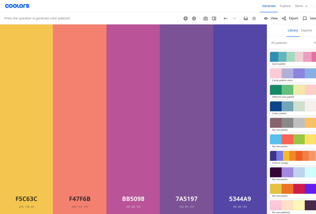
Coolors
Coolors is one of the fastest ways to generate professional-looking color palettes. With a single click, it produces balanced color combinations that work well for websites, branding, and UI design.
It’s perfect when you want quick inspiration or need to explore multiple ideas rapidly.
- Generates palettes instantly
- Lock colors you like and shuffle the rest
- Excellent for fast inspiration
Adobe Color
Adobe Color is a powerful tool built around color theory. It allows you to create palettes based on proven harmony rules such as complementary, triadic, and analogous color schemes.
This makes it ideal for designers or website owners who want more precision and control.
- Advanced color theory tools
- Create palettes based on harmony rules
- Ideal for more precise control
Canva Color Palette Generator
Canva is my most recommended design platform, and Canva’s color palette generator is incredibly beginner-friendly and very useful for finding brand color palettes.
You can upload an image, and the tool automatically extracts a matching color palette, making it perfect for maintaining visual consistency across your website, logo, and marketing graphics.
- Upload an image and extract colors
- Great for matching brand visuals
- Beginner-friendly
Color Hunt
Color Hunt offers a large collection of hand-picked, ready-to-use color palettes.
It’s ideal for browsing current design trends and discovering modern combinations without starting from scratch.
- Curated, ready-to-use palettes
- Trend-focused and modern
- Perfect for inspiration browsing
My Advice: How To Choose A Color Palette The Right Way
To choose a web color palette that works:
- Keep it simple
- Focus on readability first
- Use color psychology intentionally
- Stay consistent across your site
- Let your content shine, not compete
Your website’s colors should support your message, not distract from it.
Choosing the right colors for your website isn’t about following trends or picking what looks “cool”… it’s about intention.
When you take the time to choose a web color palette that aligns with your brand, supports readability, and taps into color psychology, your website instantly feels more polished, trustworthy, and user-friendly.
Final Tip: Keep it simple, stay consistent, and let your colors guide visitors naturally through your content. A well-chosen color palette won’t just make your site look better… it will help it perform better too.


 Check Out My Top 2 Make Money Online Training Platforms