Choosing the right colors to use on Pinterest is no longer just a design preference; it’s a traffic and click-through decision.
Pinterest has just released its 2026 color palette, and these colors are already shaping what stands out, what stops the scroll, and what earns clicks.
In this guide, I’ll break down the 5 new Pinterest 2026 colors, explain how each color makes people feel, when to use them, and answer the most common questions around the best colors to use on Pinterest for high CTR.
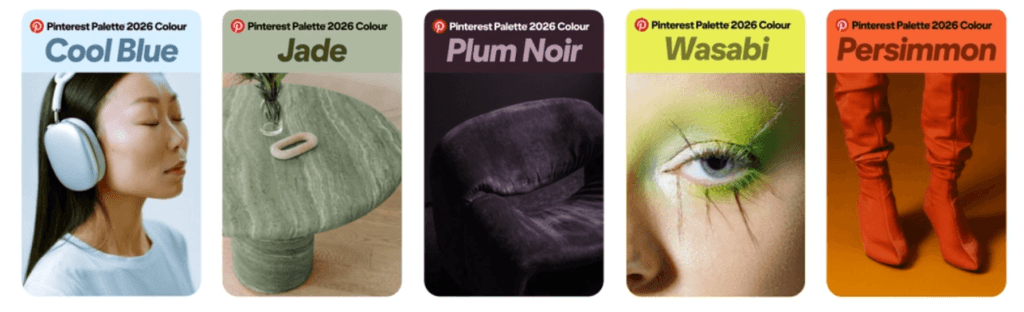
Top 5 Colors To Use On Pinterest
Pinterest is a visual-first platform, which means color psychology plays a massive role in whether someone notices your pin, feels an emotional connection, and actually clicks through to your content.
Before anyone reads a headline or understands what your pin is about, the color does the first job… it attracts attention, sets the mood, and signals what type of content they’re about to engage with.
These are the top 5 colors to use on Pinterest
- Cool Blue
- Jade
- Plum Noir
- Wasabi
- Persimmon
Each of these colors represents a different emotion and user mindset. Some create trust and calm, others spark curiosity or urgency, and a few are designed to stop the scroll and push people toward action.
When used intentionally, these colors help your pins stand out in busy feeds, communicate your message faster, and improve click-through rates by matching the right emotion to the right type of content.
1. Cool Blue - Calm, Trust, & Clarity
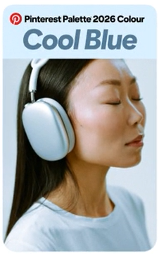
Cool Blue is soft, clean, and instantly calming. It reduces visual noise and creates a feeling of trust, safety, and mental space.
How Cool Blue Makes People Feel
- Calm and relaxed
- Safe and reassured
- Focused and clear-headed
- Open to learning
This color works exceptionally well for:
- Educational pins
- Blogging & SEO content
- Tutorials, how-to guides, and checklists
- Personal development or mindset content
Why it works on Pinterest:
Pinterest users often browse with intention. Cool Blue lowers resistance and makes people feel comfortable clicking through to longer-form content, such as blog posts and guides.
CTR Tip: Pair Cool Blue with dark navy or charcoal text for readability and white space for a clean, modern feel.
2. Jade - Balance, Growth & Fresh Ideas
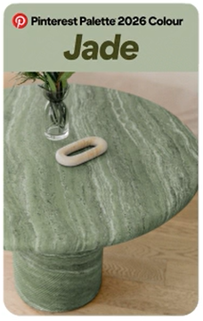
Jade sits in the sweet spot between green and stone. It feels natural, grounded, and quietly premium.
How Jade Makes People Feel:
- Balanced and grounded
- Inspired but not overwhelmed
- Safe to explore new ideas
- Connected to growth and improvement
This color performs well for:
- Wellness and lifestyle pins
- Home, organization, and productivity content
- Sustainable living or slow-living niches
- Business systems and long-term strategies
Why it works on Pinterest:
Jade aligns perfectly with Pinterest’s planning mindset. Users are thinking ahead, saving ideas, and visualizing future outcomes.
CTR Tip: Use Jade as a background color and pair it with minimal typography to create a calm, scroll-stopping contrast.
3. Plum Noir - Luxury, Depth & Authority
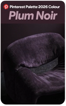
Plum Noir is dark, moody, and emotionally rich. It signals depth, exclusivity, and confidence.
How Plum Noir Makes People Feel
- Curious and intrigued
- Emotionally engaged
- Drawn to premium or high-value content
- Confident in the creator’s authority
This color is ideal for:
- High-ticket offers
- Brand storytelling
- Fashion, beauty, or interior design
- Authority-driven content (expert guides, reviews, case studies)
Why it works on Pinterest:
Dark colors stand out in a sea of light, neutral pins. Plum Noir attracts attention by breaking the pattern.
CTR Tip: Use light text or soft accent colors to maintain readability while keeping the dramatic effect.
4. Wasabi - Energy, Curiosity & Creativity
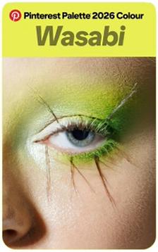
Wasabi is bold, sharp, and impossible to ignore. It instantly creates visual tension… which is great for clicks.
How Wasabi Makes People Feel
- Energized and alert
- Curious and slightly challenged
- Playful but edgy
- Motivated to act
This color shines for:
- Creative niches
- Trend-based content
- “New idea” or “try this” pins
- Short, punchy hooks and list-style content
Why It Works Well On Pinterest:
Wasabi stops the scroll. It demands attention and triggers curiosity, two key drivers in gaining a high CTR.
CTR Tip: Use Wasabi sparingly as an accent color (headlines, highlights, arrows) rather than full backgrounds.
5. Persimmon - Action, Warmth & Confidence
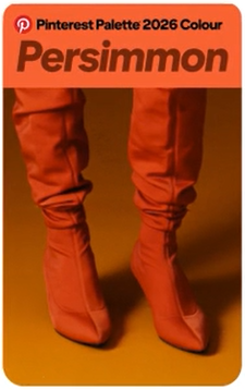
Persimmon is warm, bold, and emotionally engaging. It combines energy with approachability.
How Persimmon Makes People Feel
- Motivated and excited
- Confident and empowered
- Ready to take action
- Emotionally connected
This color performs best for:
- Calls to action
- Affiliate marketing pins
- Tutorials with outcomes (“How to”, “Step-by-step”)
- Lifestyle and success-driven content
Why it works on Pinterest:
Persimmon triggers movement. It encourages users to click, explore, and act, which is why it works so well on Pinterest pins.
CTR Tip: Use Persimmon for buttons, headlines, or overlays, especially when paired with neutral backgrounds.
Main Questions About Colors To Use On Pinterest
Q: What colors get the highest CTR on Pinterest?
A: Colors that create contrast and emotional clarity perform best. In 2026, Cool Blue, Persimmon, and Wasabi are leading CTR drivers depending on niche and intent.
Q: Should I use bright or soft colors on Pinterest?
A: Both work… but for different goals:
- Soft colors (Cool Blue, Jade) → Trust, saves, long reads
- Bold colors (Wasabi, Persimmon) → Clicks, action, curiosity
Q: Is it better to stick to one color palette?
A: Yes. Consistent use of 1–2 main colors builds brand recognition, which increases long-term CTR as users recognize your pins instantly.
Q: Do dark colors work on Pinterest?
A: Absolutely. Colors like Plum Noir stand out because most Pinterest feeds are light. Dark tones work best for premium, authority, or emotional content.
Q: How many colors should a pin use?
A: For higher CTR:
- 1 main color
- 1 supporting neutral
- 1 accent color
More than that can reduce clarity and focus.
Summarizing The Best Colors To Use On Pinterest
Pinterest’s 2026 color palette reflects a shift toward emotion, intention, and visual confidence.
The best colors to use on Pinterest aren’t just trendy… they guide how users feel and act.
Remember:
- Want trust? → Cool Blue
- Want calm growth? → Jade
- Want authority? → Plum Noir
- Want attention? → Wasabi
- Want action? → Persimmon
Use these colors strategically, not randomly, and your pins won’t just look good, they’ll earn higher CTR, more saves, and better traffic quality.